The Goal
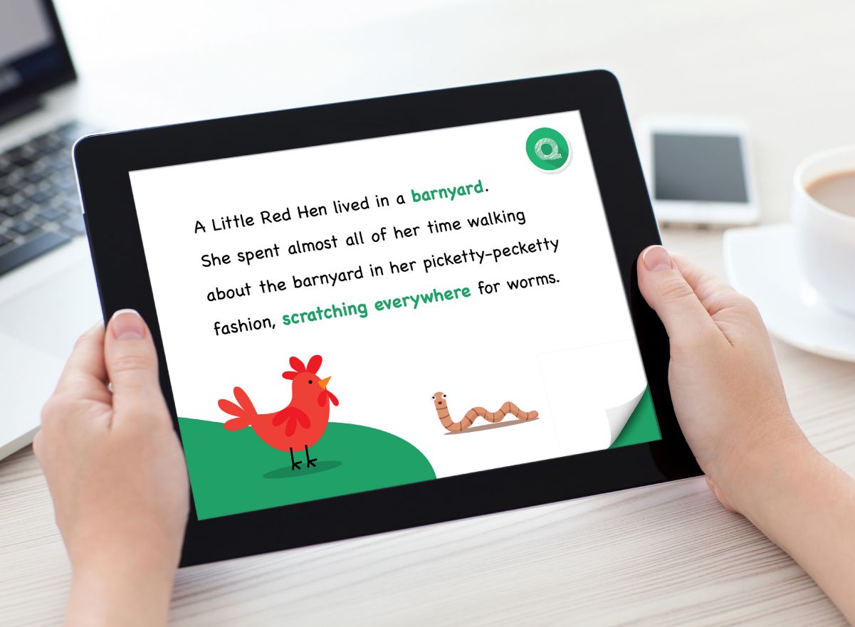
Q – Books is and app that is in development that is aimed at children to help with their reading, the algorithm encourages children to read, the child reads a page at a time and and the application will help them pronounce words that they have misread or struggled with at the end of the chapter.
The founder of Q–Books is developing the App and required someone to holistically look at the identity of the product. To make it attractive, fun and engaging for parents and children alike.
The Approach
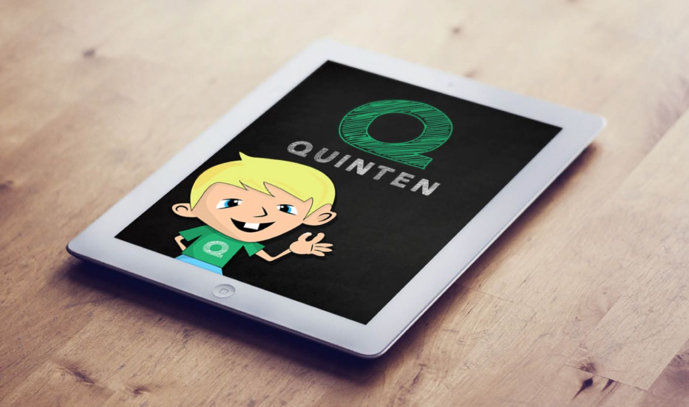
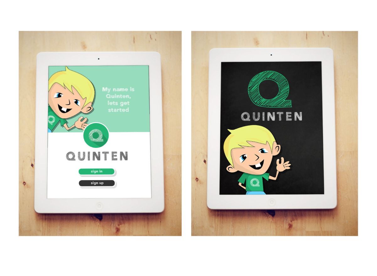
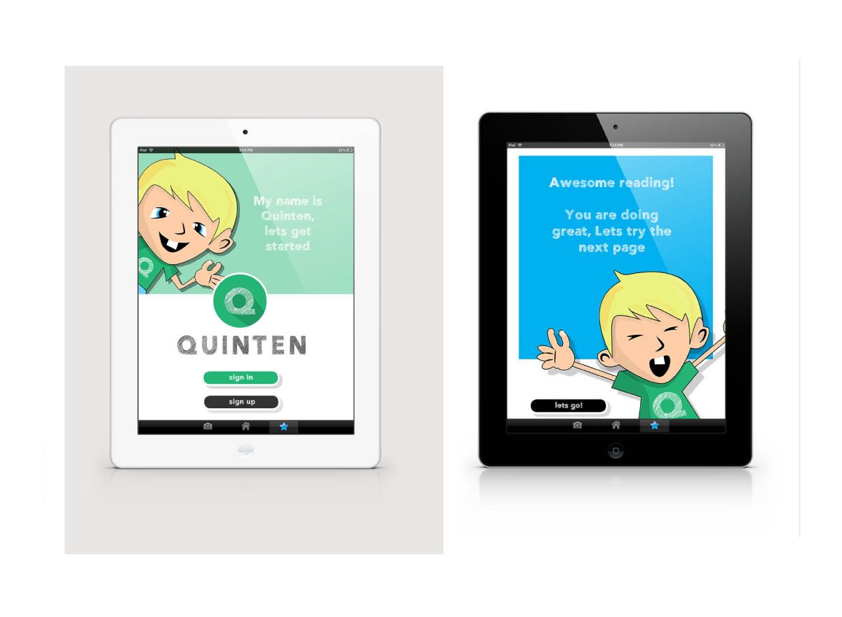
The remit was to create the lead character(s) who would guide the child through the selection of the books and also intermittently deliver progress updates and key messaging about performance. The title Q Books is derived from the founders newphew Quentin, who had required help with his reading at home so it felt right to base one of the characters on him.
CHARACTER DEVELOPMENT
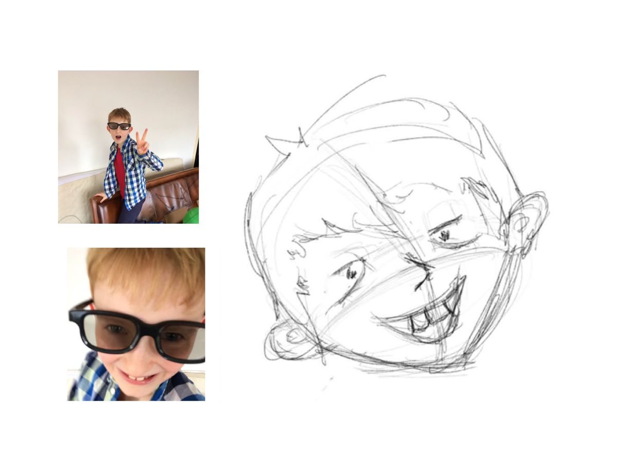
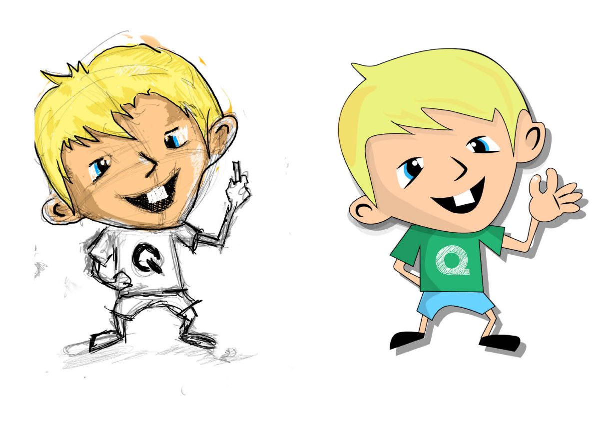
Starting with photos of Quentin it was imperative that I could create a simple vector character that could be used for digital applications and potentially animations, whilst retaining some of Quentins character and features.
BRANDING AND USER INTERFACE
The approach to the branding was to keep it friendly and familiar with a simple visual identity that could be applied not only to the user interface, but to the illustrations within the story’s themselves.
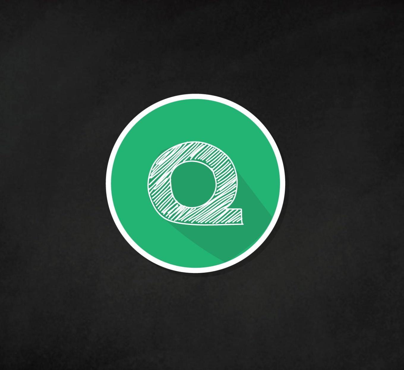
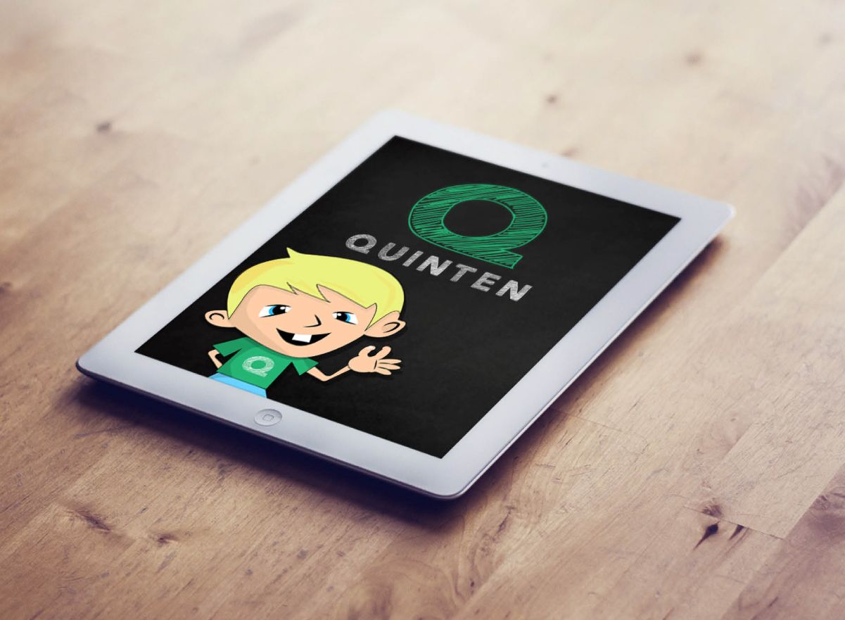
A simple logo representing the “Q” in the style of a chalk drawing was created as an icon for the brand but also an emblem for the character Quentin. The design of the chalk drawing draws comparisons to school chalk boards and learning environments, whilst still looking friendly and contemporary in isolation.
The UI for the tablet App is extremely simple to use – next steps in this project is interactive prototyping and user testing with parents and children.
The Result (Concept)
Simon worked with a brief with very little information. Was able to grasp the core messaging behind the concept. Did a great job of listening to the story and was able to turn that into meaningful designs.
Simon Selected a great branding mark and color scheme purely based on understanding the core product message.
Professional presentation of work that explained the thought process behind creative decisions, his work really brought Q-Books to life.