The Goal
Support for life is an initiative created by the barker college to support its alumni with any mental health issues they may encounter, a support line for suicide prevention, and other issues ranging from anxiety through to post-natal depression. The college really wanted the scheme to have its own identity so that students were aware that the service was available to them for life once they become school alumni – hence the name “Support for life”.

The Approach
I was first approached to create a logo for the support for life scheme and my first port of call was to review the current identity of the college and how the support for life sits within that, I was weary of creating a sub-brand of the college without first investigating the current assets.
Current Brand
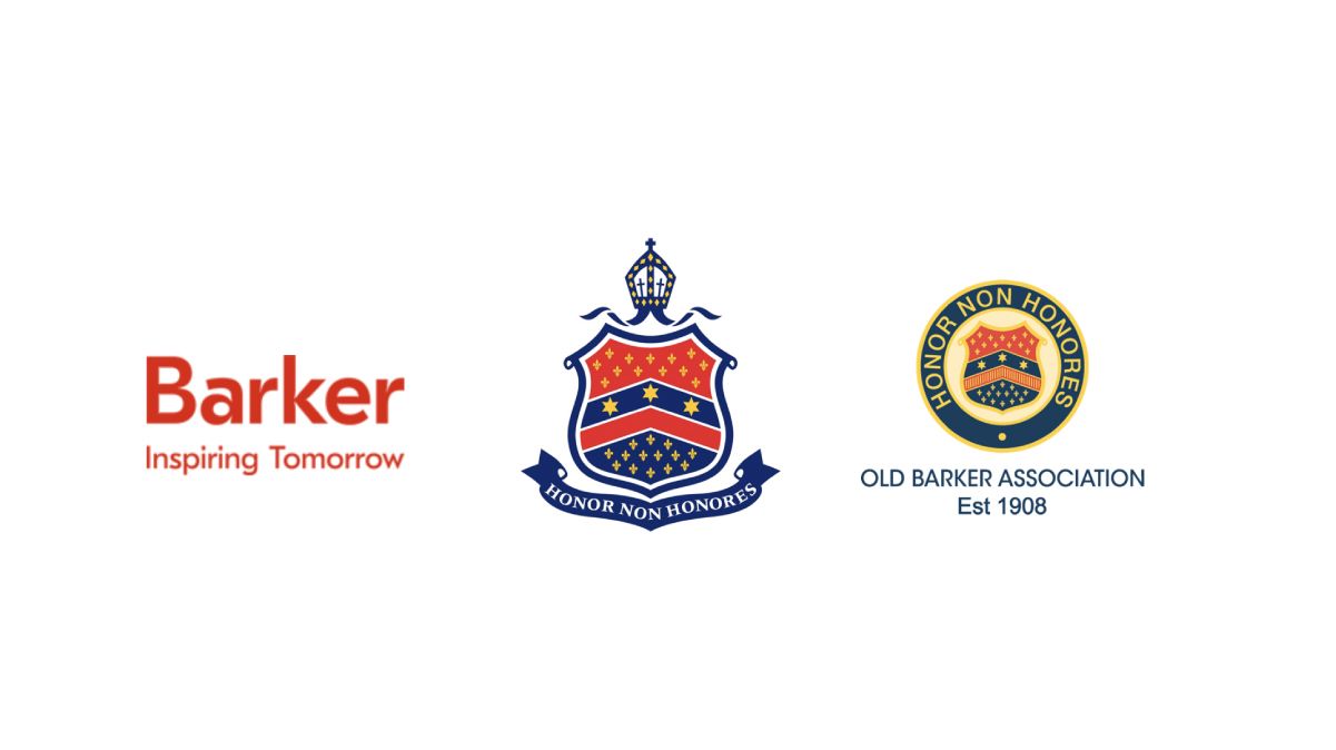
Upon investigation, the barker college already had three different logos attached to its brand, firstly the crest of the barker college which is the overall sacred brand identifier, an alternate version of the sacred crest that is for the OBA, and thirdly a more modern “barker” logo for the website that is purely for a digital application.
Looking Ahead
I felt that this project was much more than jusr the creation of a logo and there needed to be strategic thought to how support for life exists within the current brand and what can be done to elevate the scheme through visual identity, the strategy from here was to create something that:
Is iconic
Has longevity Lets see this still in use in another 100+ years
Lives comfortably with barker brand
Upholds the values of barker college and the OBA
Has meaning beyond design
From here my approach was to try and capture the essence of the brand and really dig deep into what message it was trying to convey to its clients. Whilst the brand pillars of the Barker college itself were more focussed on prestige, heritage, reputation and academia. I felt that “support for life needed” to visually convey a message of:
- Care
- Family
- Support
- love
The visual had to tick all of these boxes.
Design Development
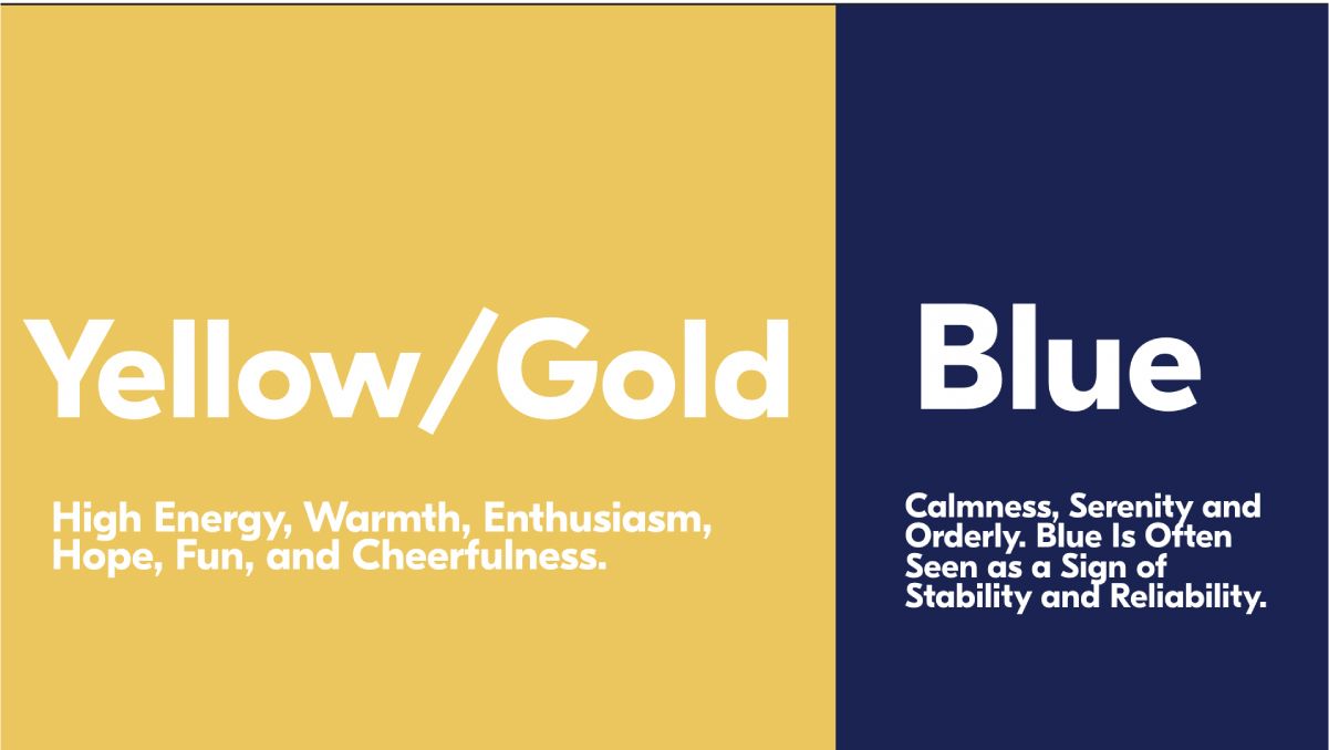
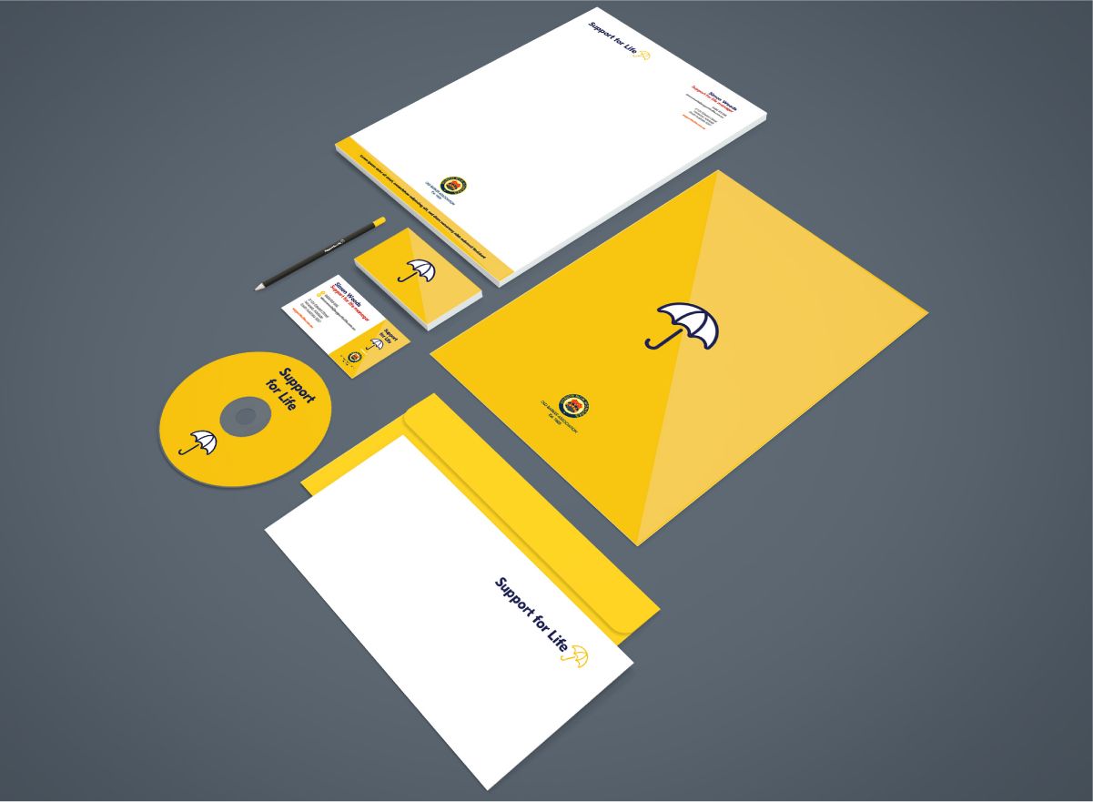
Starting with the brand pillars for support for life I started sketching ideas for a “motif” that would symbolise this entire program. I elected to keep the colour scheme and font from the barker college to ensure of some continuity and familiarity when developing the motif.
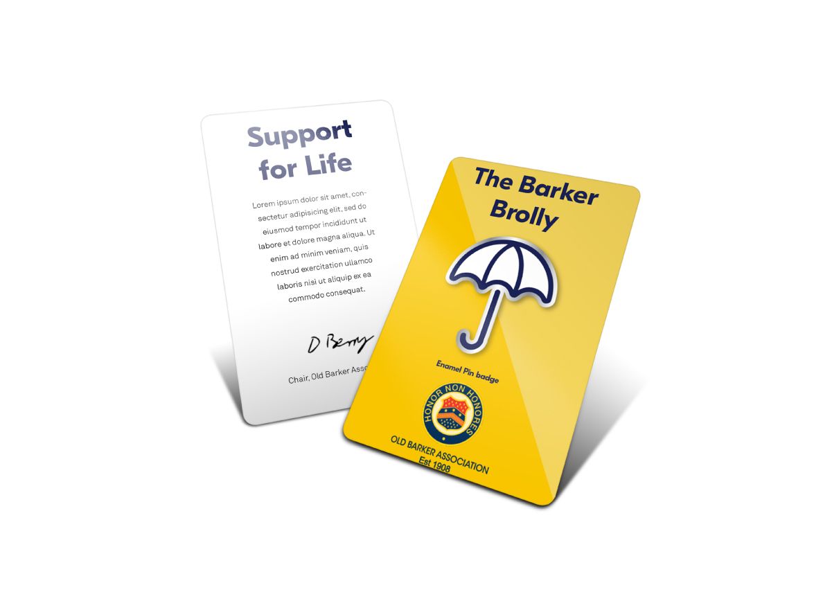
The Barker Brolly
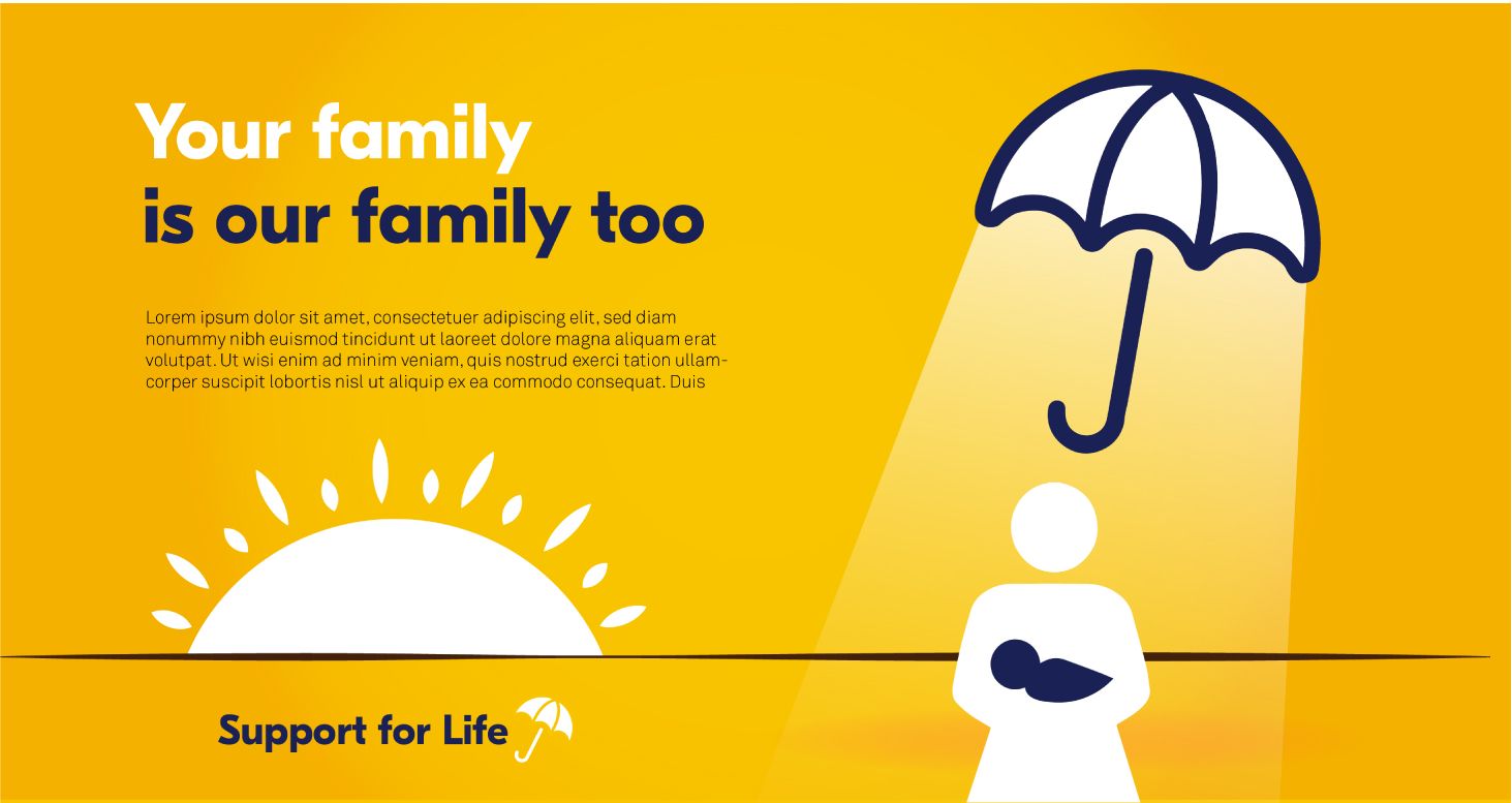
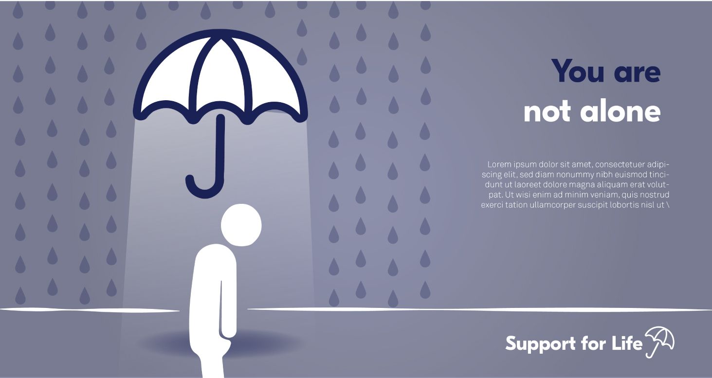
After various sketches and development of several designs, I felt that the barker brolly was a very powerful motif for the support scheme, not only is the humble umbrella a symbol of personal safety and shelter, but it’s also something that a loved one might hold over you to keep you dry, I felt it also was a metaphor for the Barkers overarching care for all of its Alumni.

Photography Style
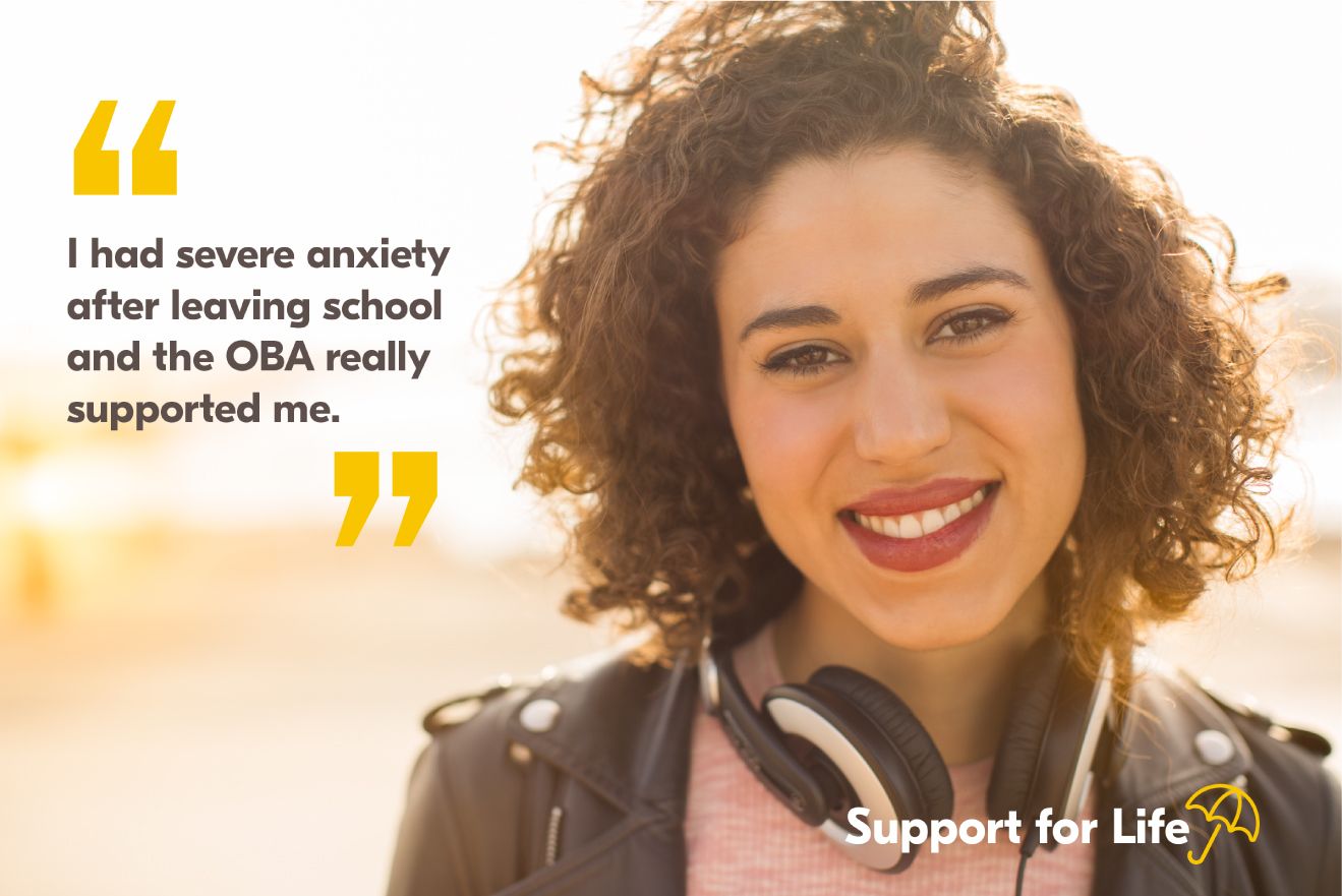

Illustrations
An illustrative style was developed to communicate some of the more difficult subject matters and the use of the umbrella can be seen within them offering shelter and advice. And also a photography set that was intended to promote positivity without being condescending or insensitive to the people suffering with mental health issues.
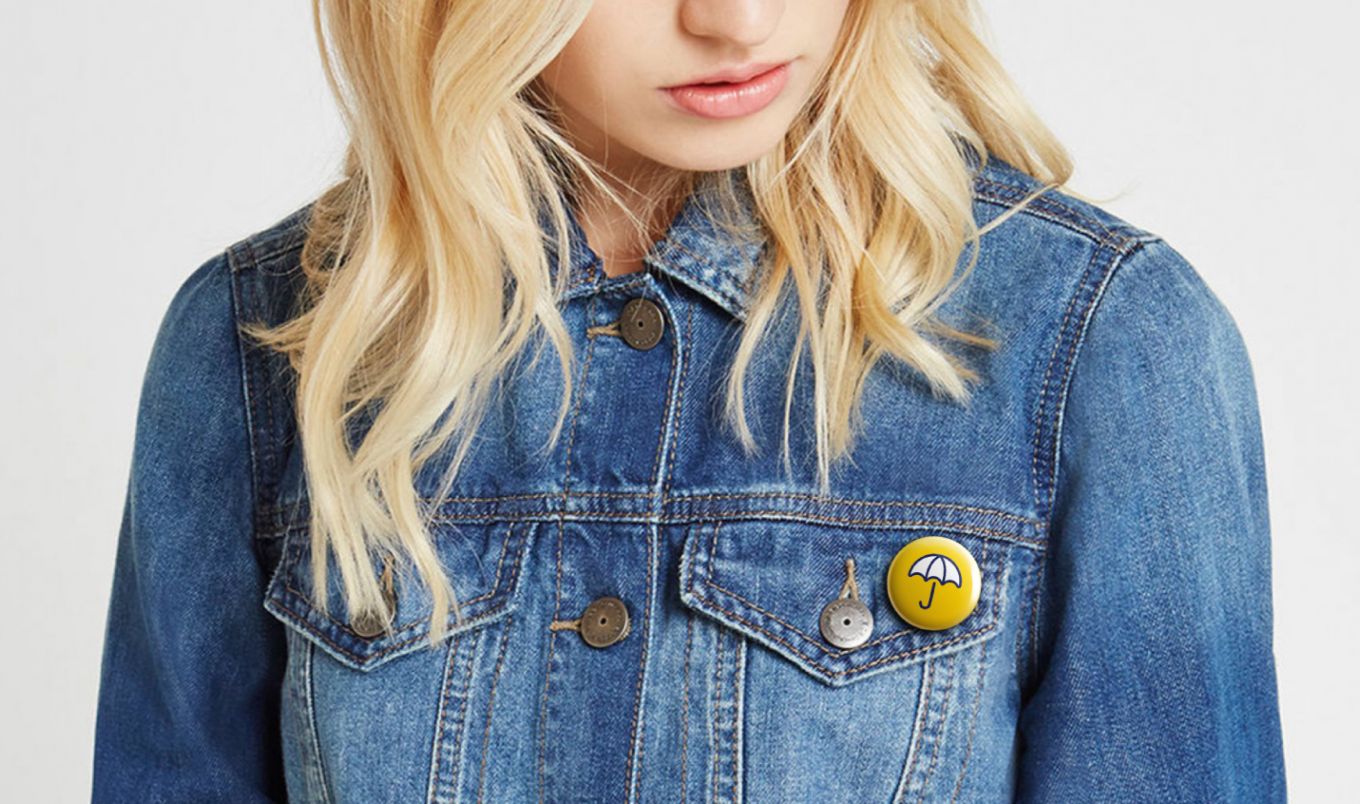
Pin Badge and Promotional Items
The Barker Brolly Pinbadge was an idea for longevity and awareness of the scheme, the idea is that all alumni be given a brolley pin badge when they graduate, a keepsake for life to remind them that the scheme is always available to them and to keep awareness. Elegant and subtle the umbrella .


Simon approached the re-brand for the Old Barker Association, Support For Life initiative in a very considered, strategic and creative manner. Taking the time to understand the rationale and vision, Simon created a visual icon that is not only a tangible metaphor for the whole initiative but also easily understood for even non-creatives with the umbrella motif symbol.Simon created this new brand all whilst leveraging off the existing brand assets which was important for familiarity within the Barker community.The quality of Simon’s work is exceptional and was universally adopted by the committee and key decision makers.