The Goal
Pacdon Park are a manufacturer of artisan British produce creating fine British foods for the Australian market place.
After 7 years of production Pacdon Park’s sales had plateaued. With an emphasis on increasing produce sales it was felt that a more contemporary and eye catching approach to packaging was needed, not only to increase product sales but to appeal to a more diverse group of resellers.
I was instructed to conceptualise a new direction for the branding of the packaging of the entire range of products (Bacon, sausages, pork pie, haggis, black/white pudding and gammon) whilst working within logistical and economic constraints of the business to would stimulate growth in sales
The goal was to create something contemporary, iconic and quintessentially British, that also upheld the local identity with an emphasis on not looking quality and not mass produced.
The Approach
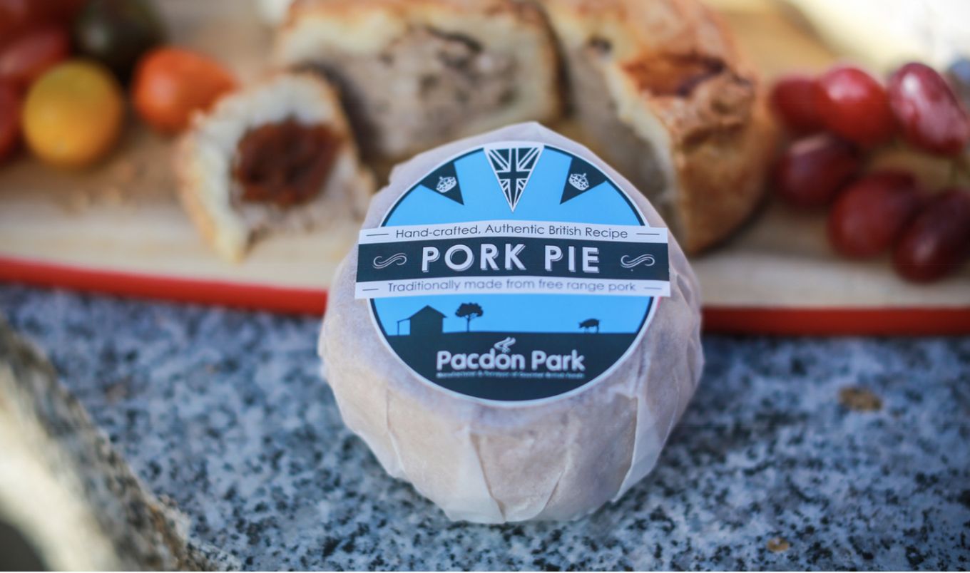
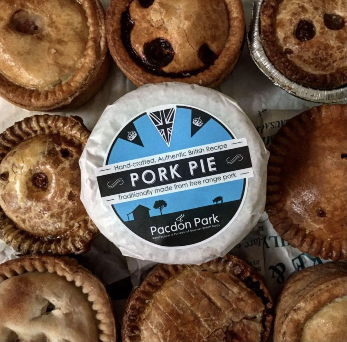
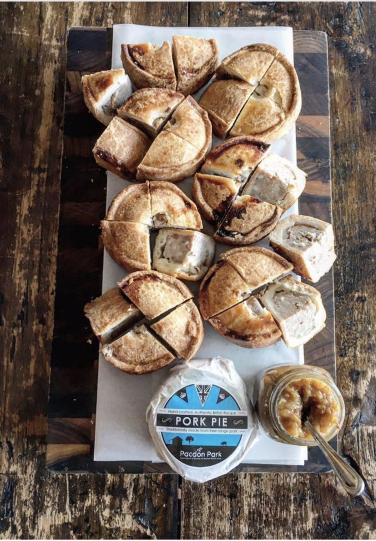
THE FAMOUS PORK PIE
The pork pie is Pacdon Parks flagship item, iconic in England and not easily found in Australia. Pacdon parks pork pie is regarded as one of the finest you will taste outside of the UK and is created to an age old recipe from free range produce.
The initial approach was to create a new packaging design for just the pork pie to begin with to test to see if the packaging was influencing the generation of sales and interest of local retailers.
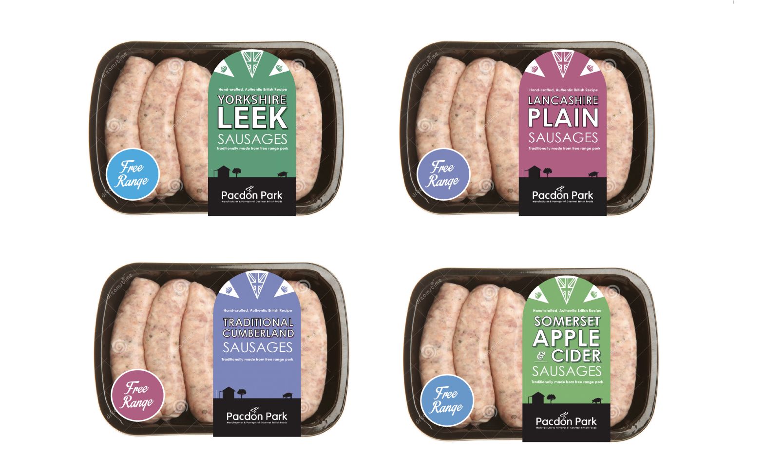
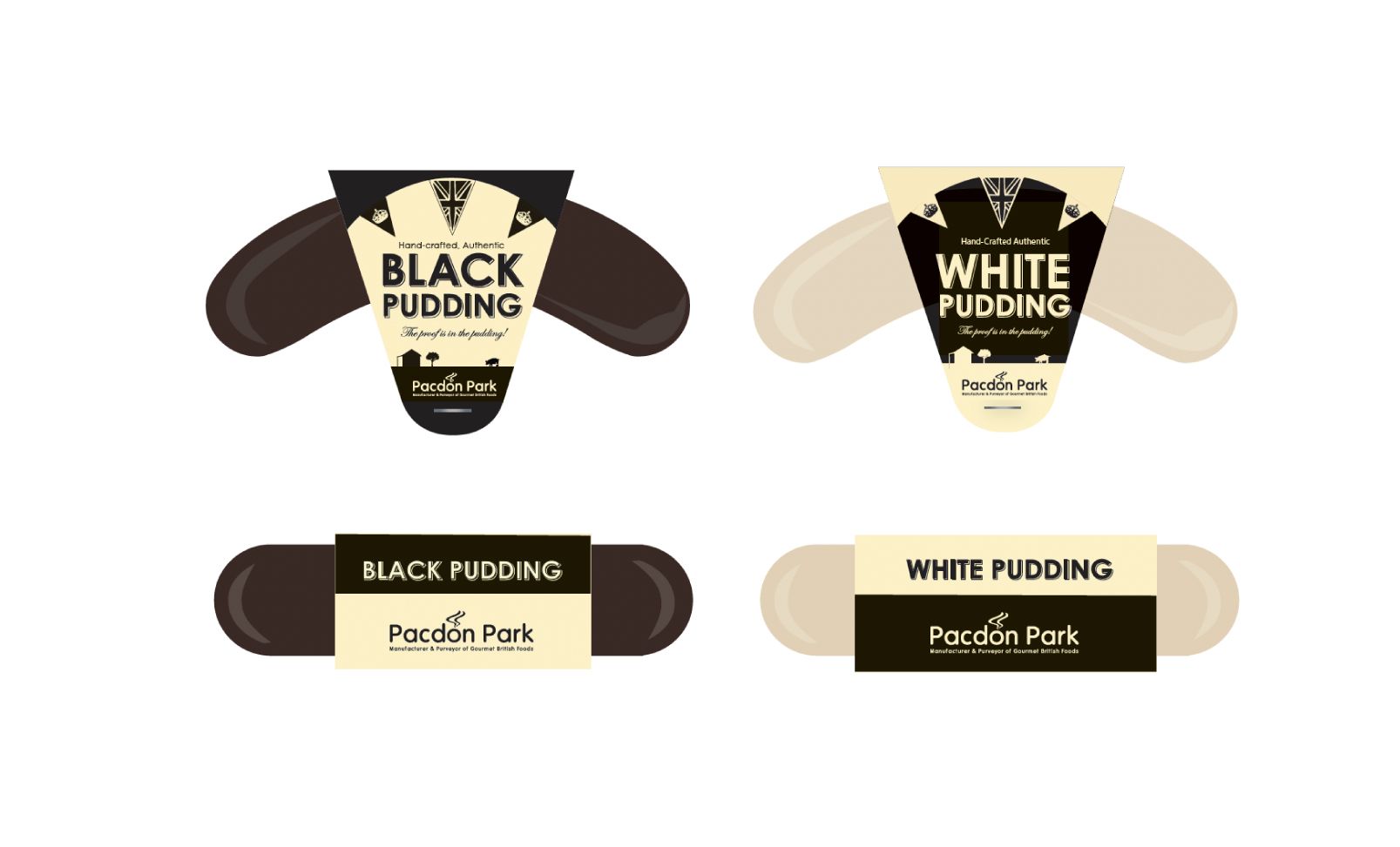
The existing branding was becoming a little bit tired and really only demonstrated its “Britishness” via the addition of a flag onto the artwork, My approach was to look holistically at the labelling and devise a design system that would integrate British features without it looking like an addition to the existing artwork that otherwise had no overall British theme to it.
I devised a system containing 2 design artefacts that could appear across the entire range that tackled the two main visual remits:
- Britishness
- Local hand-made free range produce (not mass produced)
The Farm
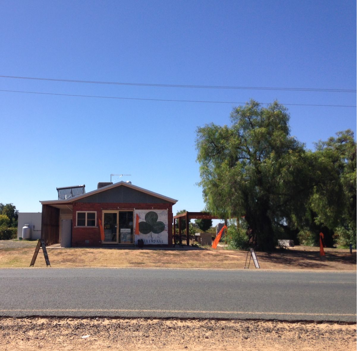
I visited the Pacdon Park factory in Echuca Moama in regional Victoria, The factory itself is small, quaint and resides on a large acreage, the landscape is broken up by a solitary Oak tree.
I started to develop a footer/lockup that could be used across all designs that would encapsulate the landscape within the artwork and provide an instant visual to the purchaser of a local, independent business with quality goods.
The lockup includes the silhouette of the factory with the oak tree with the aim of this becoming an iconic and immediate visual identifier across all Pacdon Park packaging in the future.
The Bunting
I looked at ways of creating a British feel to the artwork that was more integrated into the branding than just adding a British flag on there.
Hanging bunting at celebrations is a very British Tradition and adding bunting to the artwork with a British flag as the bunting artwork worked well with the design and shape of the labelling.
The Result
I cannot rave enough about the quality and high standard of simons work, from surpassing our brief and opening doors to our products that we never thought packaging could. The rebrand opened doors to to some of the countries largest retailers like David jones and coles that would have previously been closed to us”
Simon is a pleasure to work with and our only stop for design