Overview
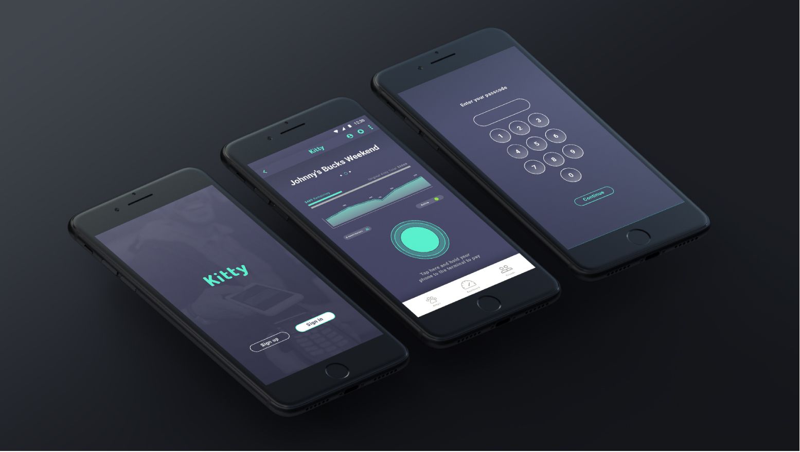
Kitty is an app that brings the traditional ‘cash kitty’ into the digital age.
Kitty allows groups of people to manage money together in the form of a ‘digital’ cash kitty operated exclusively through a user’s mobile device.
Users can pre-load, moderate, pay and manage a group kitty at the push of a button.

Part 1 – Discovery phase
Headline
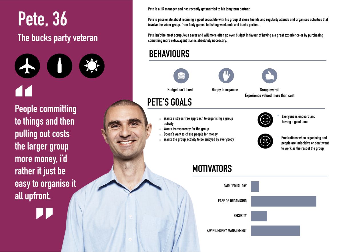
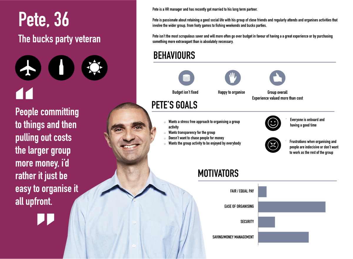
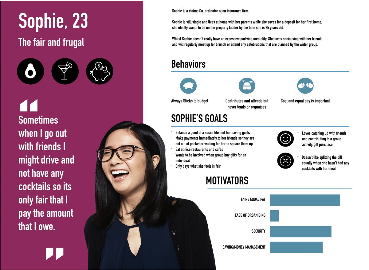
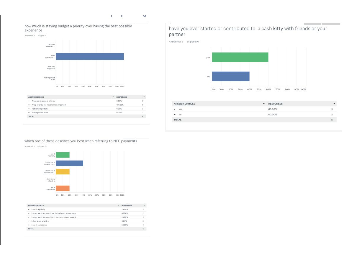
Generative research was conducted via 5 user interviews – From which a customer journey map and two distinct user persona’s were created.
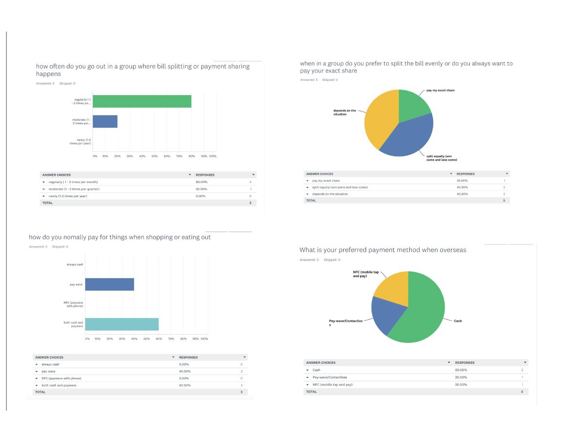
We then followed up the interviews with preference research via a survey to further validate the findings from the generative interviews.
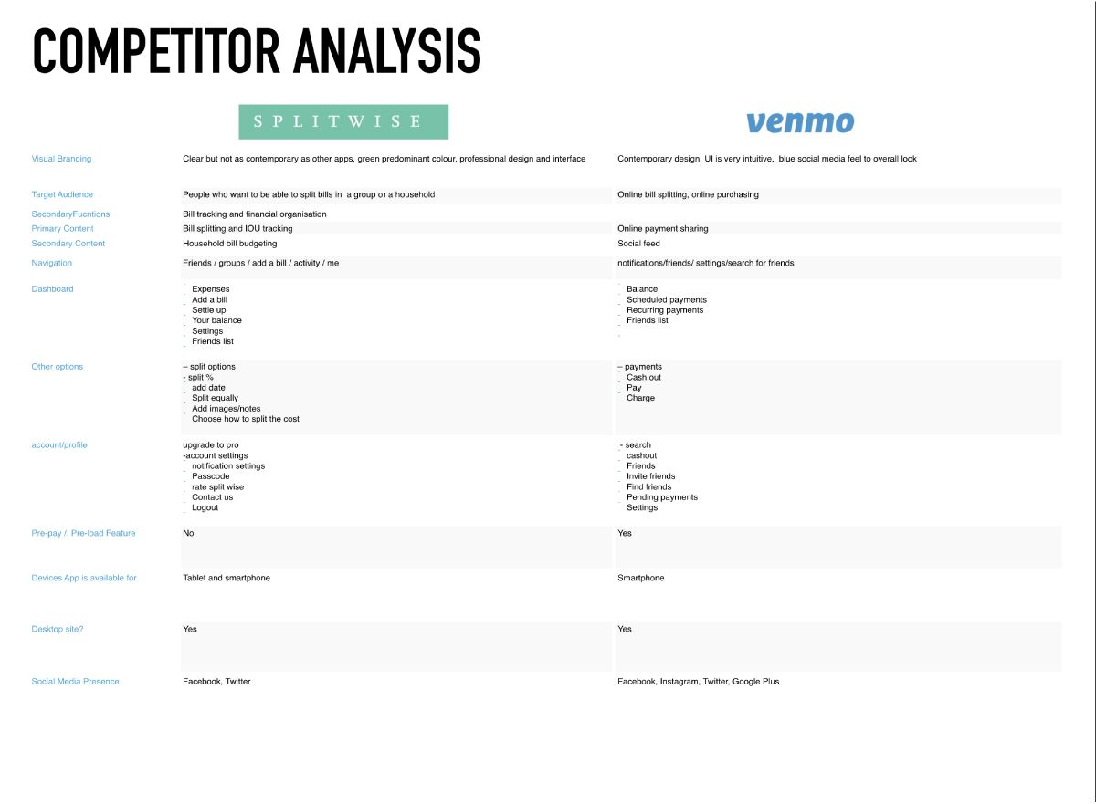
Competetor analysis
In addition to this, a competitor analysis was conducted on two major pay-share apps, a recommendation would be to execute further competitor analysis on existing Travel Card services.
Initial findings
Competitor analysis did not identify a direct competitor in Australia for the App, as none of them targeted a “pre pay” feature. However, such features regularly exist in the travel category. .
Through user research it was identified that there was very little existing brand knowledge across pre-loaded travel cards and pay sharing category,
Spending behaviours were different across the personas’ but overall themes became apparent such as cash being a preferred payment method when overseas, and that NFC payments with smartphones is yet to become part of an individual’s routine.
The Opportunity
There is opportunity to create a minimum viable product from the limited research undertaken, that will give the user a personalised group payment organisational tool for the planning, execution and tracking of any group activity where pooling the money would be beneficial.
The enquiries revealed many common patterns and themes which have influenced the following areas as opportunities to become a true differentiator in the payment sharing category:
- Simplified User Interface
- No exisiting brand recognition of competitors
- Cash is preferred when travelling
- Opportunity to make NFC a preferred payment method
- Different user segments have different uses for the app
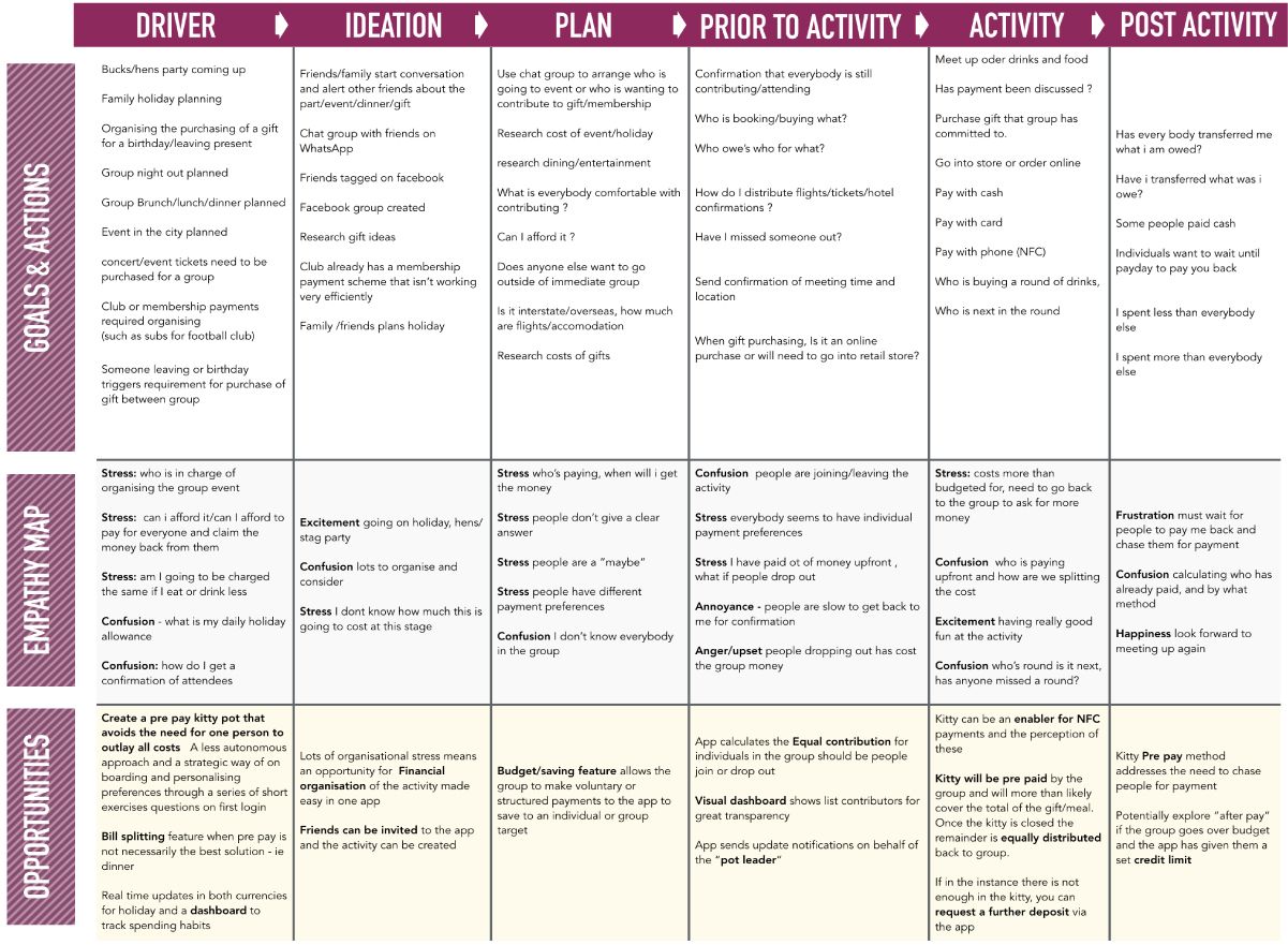
Now that we have identified the gap in the market, The empathy map is an extremely useful tool to enable us as designers to create a product that delivers a solution to common pain points and desired features. The customer journey map below highlights the key milestones of the user journey, the pain points in that journey and the opportunities that presents to us as designers.
From this we can plan out what features will make our product different from what is in the market by providing user centric evidence based solutions.
The Opportunity
So how do we make Kitty a great experience?
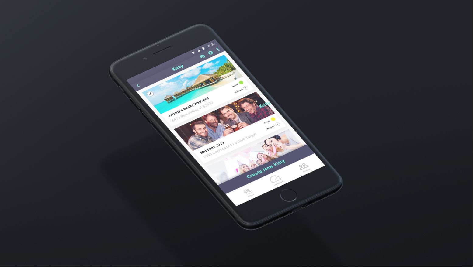
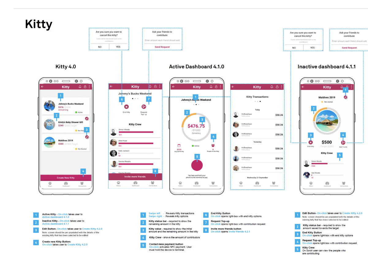
SMART DASHBOARD
The dashboard not only gives everybody in the group a real time overview of the status of the kitty, but it also allows anyone in the group to select “tap and pay” and use the app as a contactless payment method.
The dashboard will also show a list of transactions and who has made them, it will give information on the groups deposits and a quick glance at spending habits via category ie; Food, Travel etc.
MANY WAYS TO PAY
The main way to pay is via the app itself through contactless (NFC) payments, but should the owners of the app prefer a different method a physically Kitty Card is despatched with each sign up for the app and is directly liked to whichever kitty is active at that time,
The group (by majority) can also approve a cash withdrawal should you be in a situation where contactless payments are not accepted.
TRAVEL
Kitty can be used in the same way that a pre-loaded travel card and can be a useful tool for saving for a holiday, and budgeting whilst on holiday, The kitty dashboard can show the kitty status in two currencies, so you will no longer need to make calculations about your budgets.
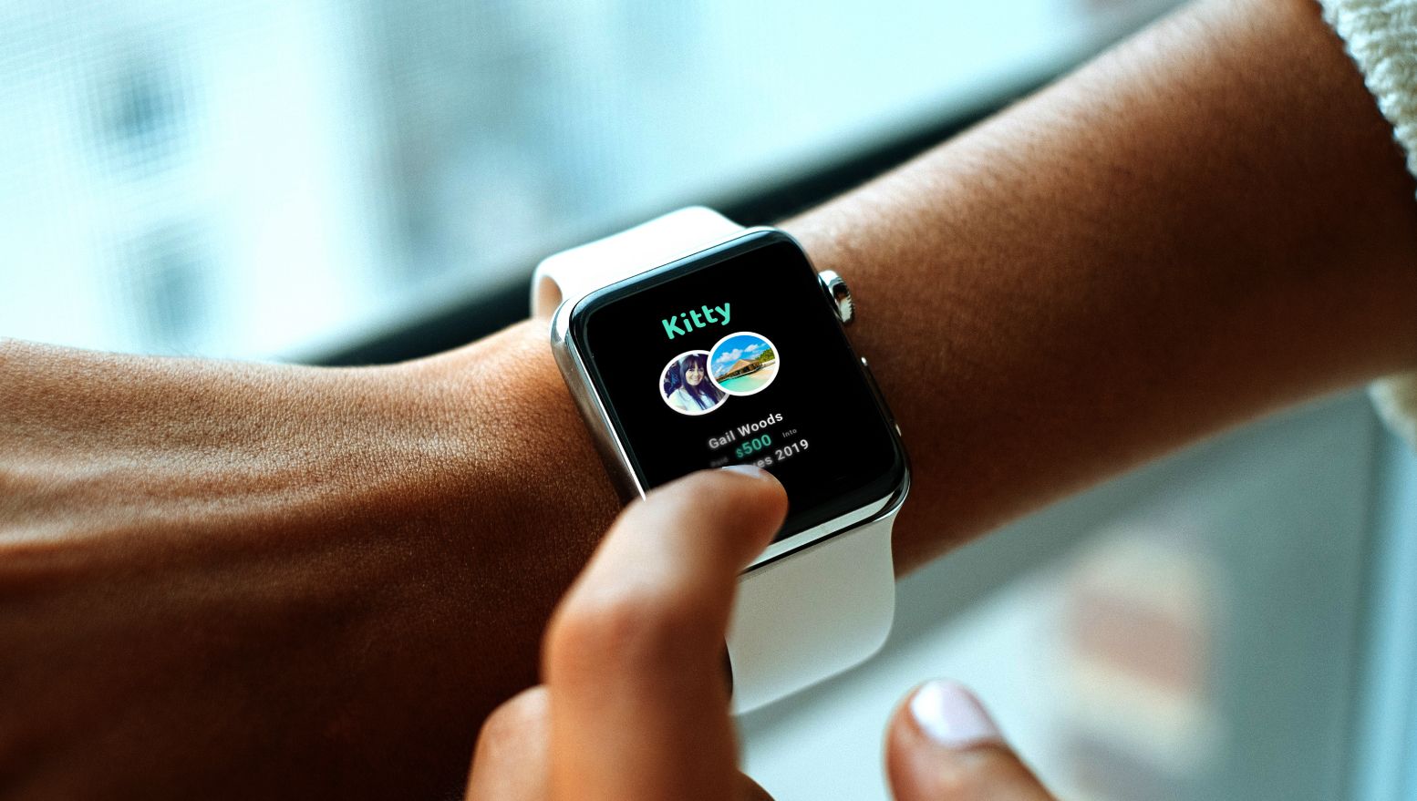
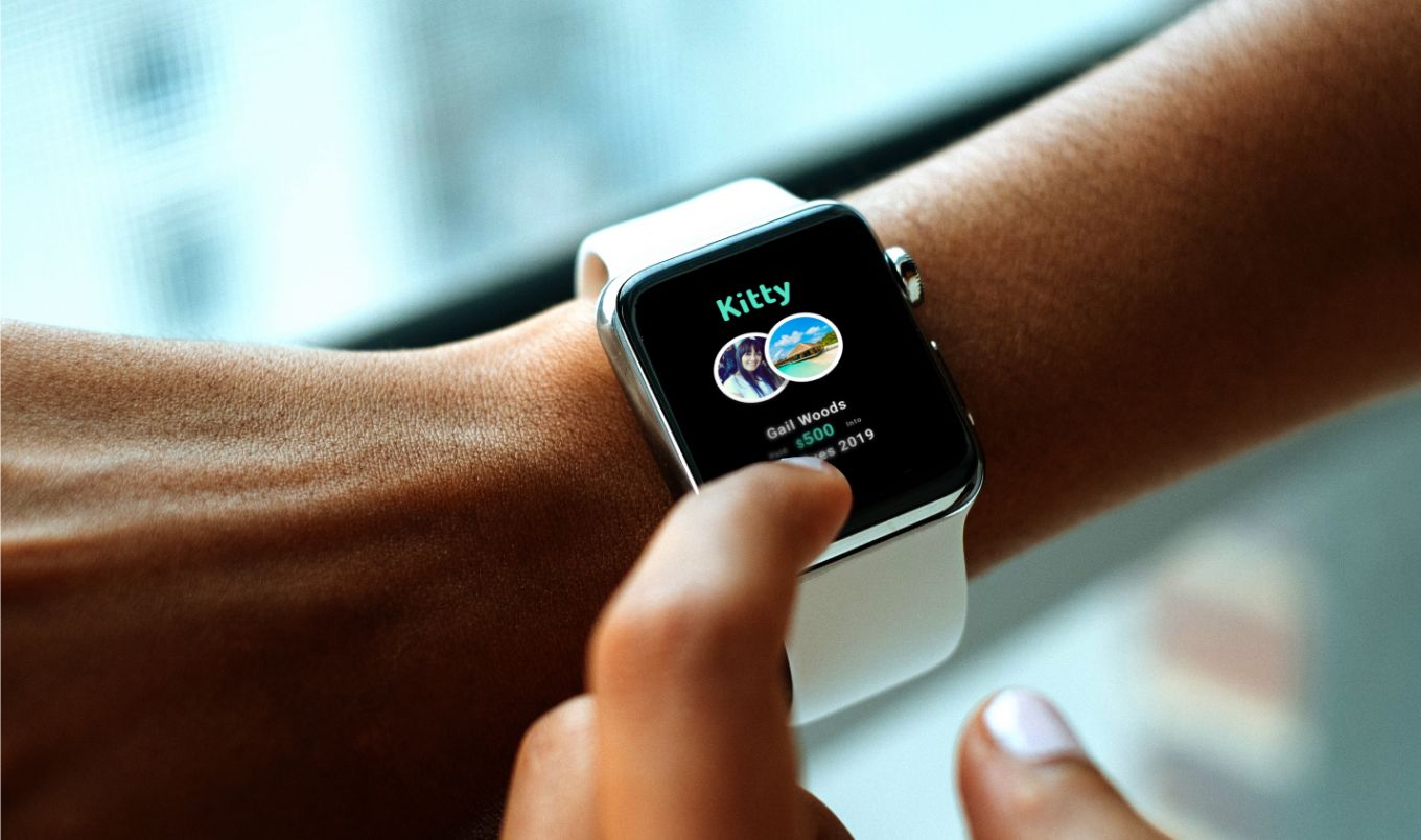
GROUP ACTIVITIES
From bucks and hens parties, a milestone birthday to attending the grand final in another state. Kitty has you covered.
By pre paying prior to the activity/event, the organiser doesn’t need to foot all of the bills upfront, He or She can start a kitty and invite your kitty friends to contribute. Then these funds are used at the event/activity.
GIFTS
Buying a gift for a significant birthday, a baby shower or a farewell? In most instances the the person who puts their hand up to organise a gift from a larger group has to put the money up front and then ask for the cash back laters, often resulting in someone being out of pocket, Kitty allows you to collect the money upfront.
HOUSE HOLD/RENT/BILLS
Live in shared accomodation or have a flatmate? When the bills come in these can be added to kitty and a request can be sent to your flatmates, and they can add to the kitty prior to the Bill due date.
MEMBERSHIPS/CLUBS
Maybe you are the organiser of a footy team and are sick of collecting $10 – $15 per week to pay your fees, or find it hard to get the money together for new shirts.
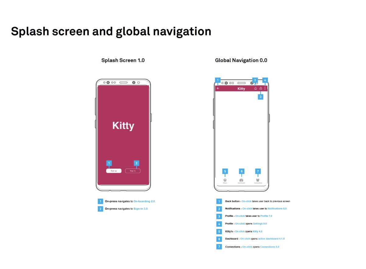
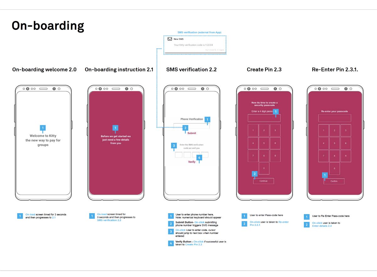
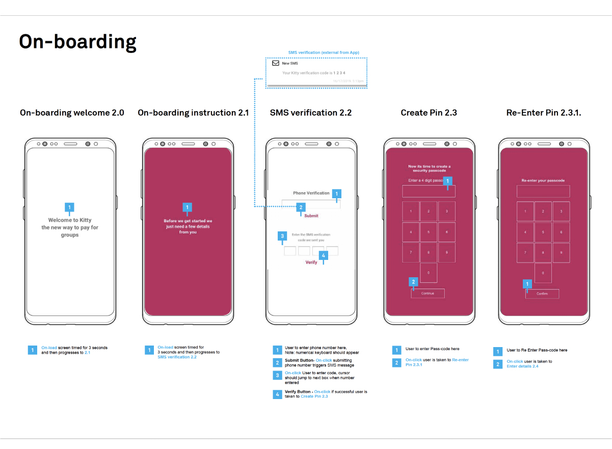
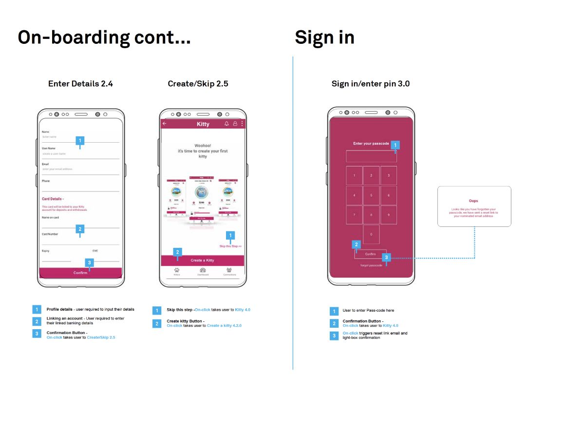
Part 2- Wireframes and Information Architecture
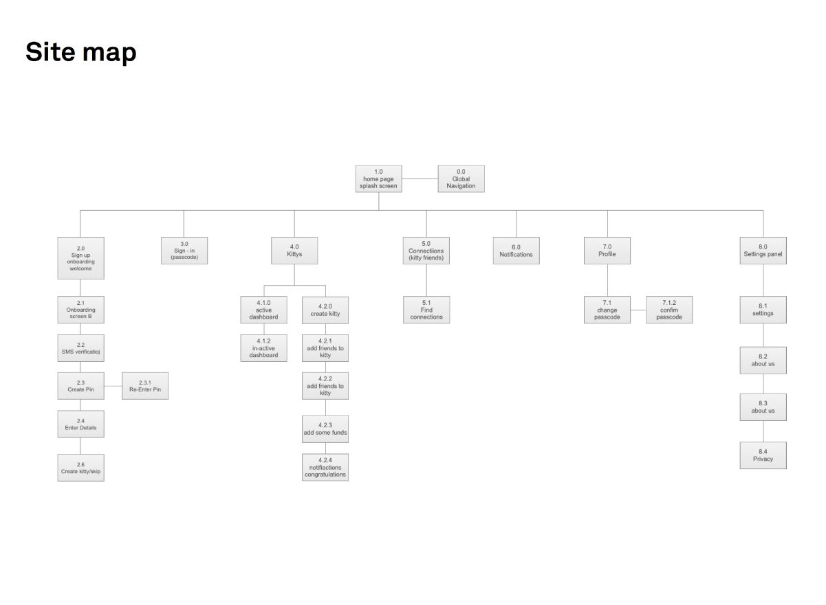
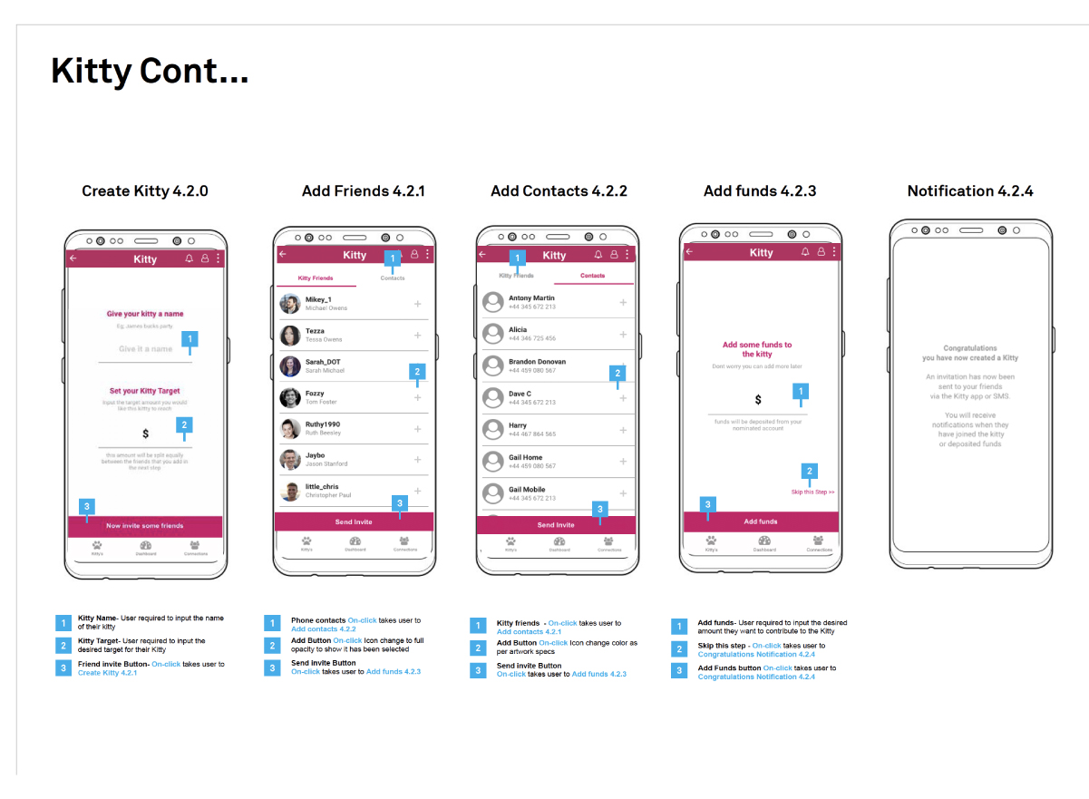
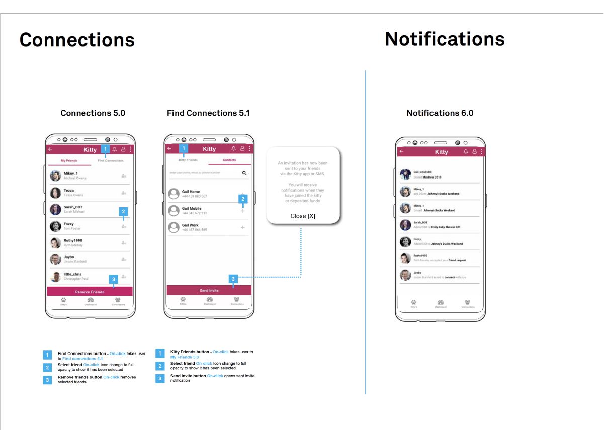
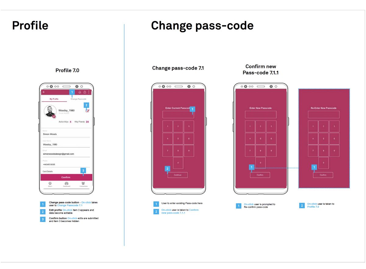
Once the features had been solidified it was time to work though a robust information architecture and sitemap. The annotated wireframes below were developed from the finalised information architecture
Part 3- Prototype User Testing
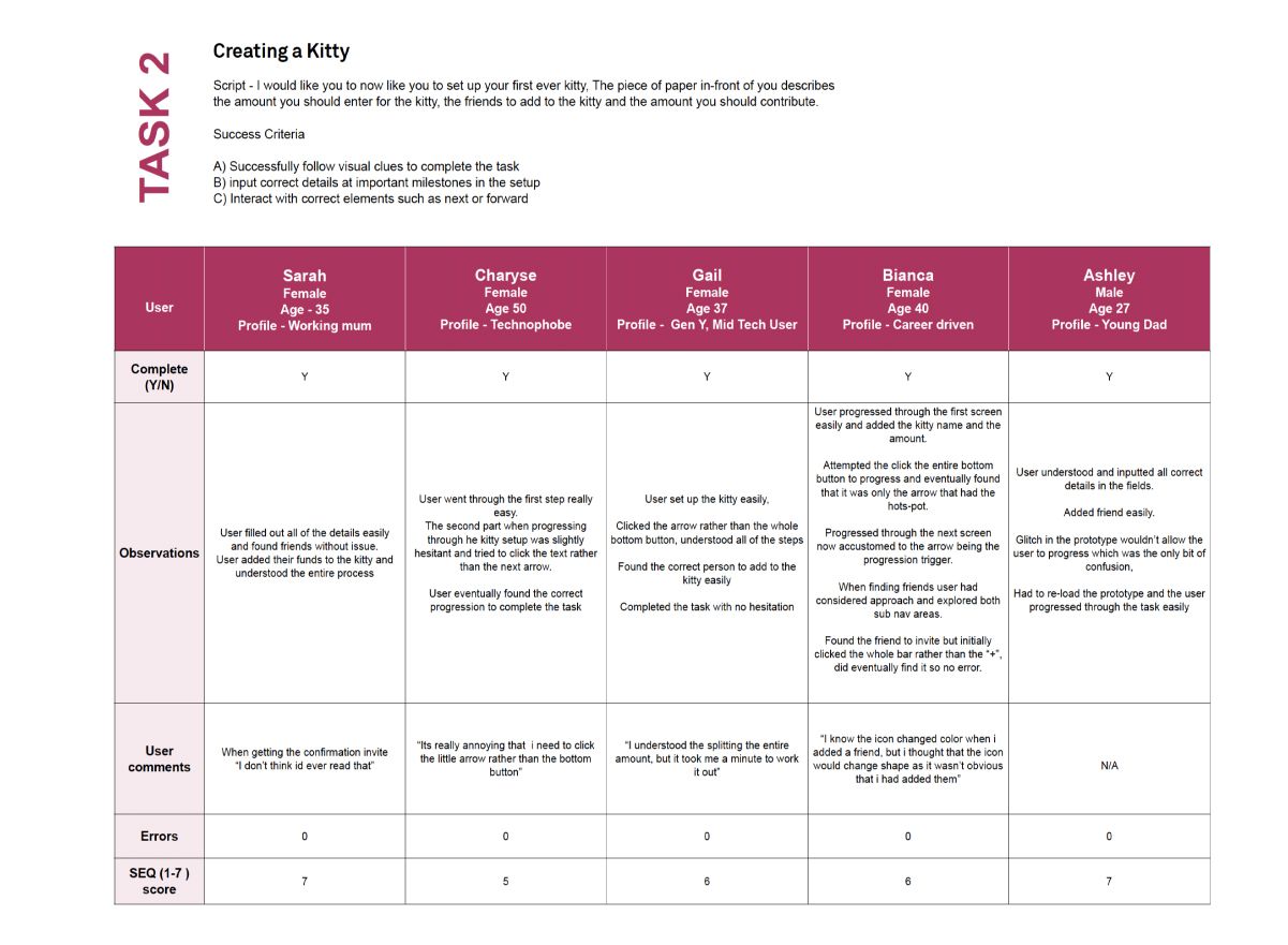
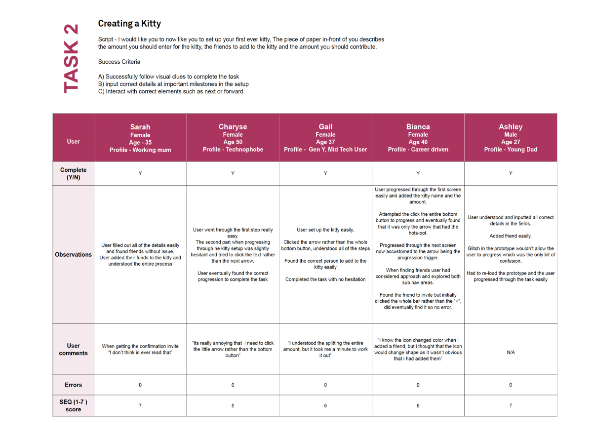
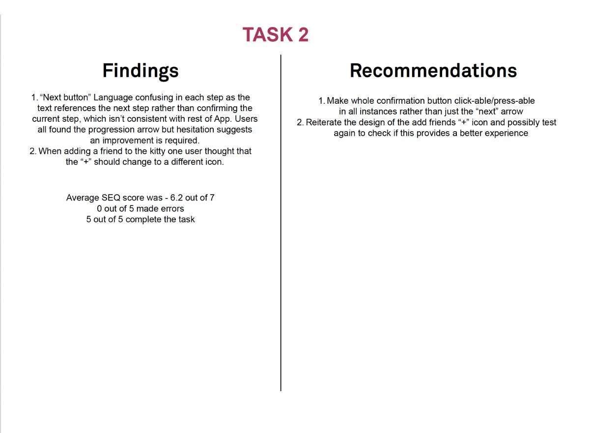
The initial generative research which was followed up by some preference research via a survey, we then proceeded to develop a minimum viable product prototype. The Prototype had all of the core functionality of the Kitty App in order to be thoroughly user tested.
User testing was necessary with the prototype to ensure that all of the key user flows were intuitive, easily navigated and lacked pain points. Language and visual clues were also fundamental testing heuristics.
Kitty prototype walk-through video
Schedule
With three weeks to complete the usability testing, design reiteration, and wire-frame specifications for developers, it was imperative that the user testing was complete in week one.
Recruitment
Five users were selected to test the first wire-frame prototype. 80% of issues are found with just five users and this was deemed sufficient.
Recruitment took place over a 2 week period with three of our initial user research interviewees selected for user testing on the basis that they were strongly linked to the persona’s that we developed. The other two candidates were selected for a better balance of gender and age groups. Charyse in particular was a self confessed technophobe. So testing on a user with limited experience with online applications was a good test for the overall user experience and the Apps intuitiveness.
Medium
We presented the users with a sheet of paper which highlighted the goals of the Kitty App, explaining the SEQ scoring system, we also gave them the required data to enter to complete two of the tasks.
We then create eight scenarios, each with an inbuilt task that they would be required to complete. The tester (me) was able to mirror the device screen onto my own screen. Screens recordings were made and reviewed over a 1 week period.
Part 4- High Fidelity User Interface
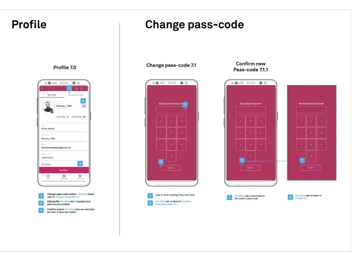
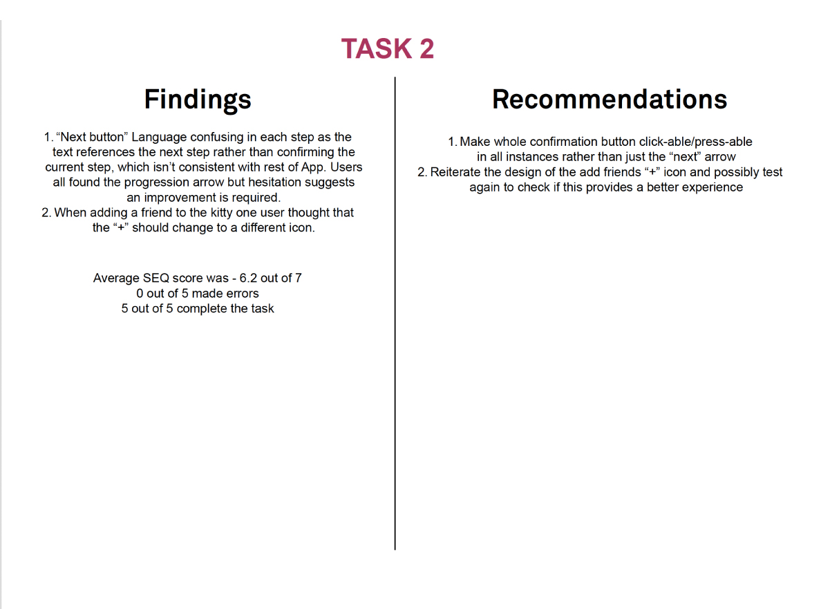
From the user testing the designs have since been re-iterated based on some of the recommendations found through the testing. The majority of recommendations are centred around the language and some consistencies with non-global navigational buttons.
Further user testing can be applied, however we are confident that this product can now be
deployed to development.