The Goal
Booty Transformation Club is a family owned group fitness centre in the north shore of Sydney. Due to the popularity and growth of the business the owners looked top open the Booty Transformation Club in other areas of Sydney, with a view to Franchising in other states in the near future.
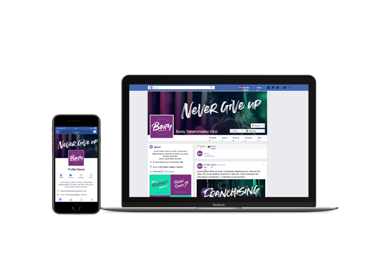
With Franchising on the horizon the goal was to produce a contemporary brand that better represented the overall ethos of the gym, Empowering females to be healthy and fit in an inclusive and fun environment. My Remit was to produce something in line with the brand values that was contemporary, scalable to a national endeavour and easy to roll out across traditional and digital platforms.
A more professional and tighter brand also conveyed a message of professionalism to potential franchisees.
The Approach
Review the existing Brand
Upon reviewing the design assets (logo, colours, fonts visuals) and the brand consistency, it became clear that there was a disparity from the fun and contemporary vibe of the sessions and the visuals that are currently supporting it. The colour scheme when represented Digitally was a little drab and the logo was a little outdated and had no variations for responsive application.
Overall, the consistency across the digital and print collateral that the owner was producing was overall well accomplished given there was no style guide for freelance designers to work from. It certainluy required a review and required a more robust design system to ensure of consistency accros all platforms in the future.
LOOKING AHEAD
My approach was to try and capture the essence of the brand and really dig deep into what message it was trying to convey to its clients. from conversations with the owners we agreed that the core brand values were that of:
community,
Inclusiveness,
empowerment
Feminity
The visual had to tick all of these boxes.
RESEARCH
To start I enlisted 10 female gym goers between the age of 20 and 40 to try and capture what they were looking for in a fitness provider, their experiences online and in person. And what they value in a fitness brand (of anything) We asked them a series of 10 in depth questions.
The key out takes of the research were:
- The most important asset to the gym/brand is the trainer.
- Females often felt intimidated by the prospect of going to the gym and looking either foolish (for not knowing how to use the equipment) or feeling self-conscious if training with other females who perhaps have very athletic physiques.
- Location is far more important than cost, just knowing that they can access a gym that’s close to home or work so that they can work-out without adding a commute onto an early start. Costs and membership lengths were less important factors in their decision making.
- With group programs, the subjects highlighted that friendships and healthy competition were main drivers for sticking with a program.
Design Development
From pairing the research up with the brand core brand values, I knew that I had to create an identity that made people feel part of the community (or club), a visual that was friendly and approachable so that the level of intimidation was reduced, a sense of female strength and empowerment …. . and most of all make it FUN!
COLOURS
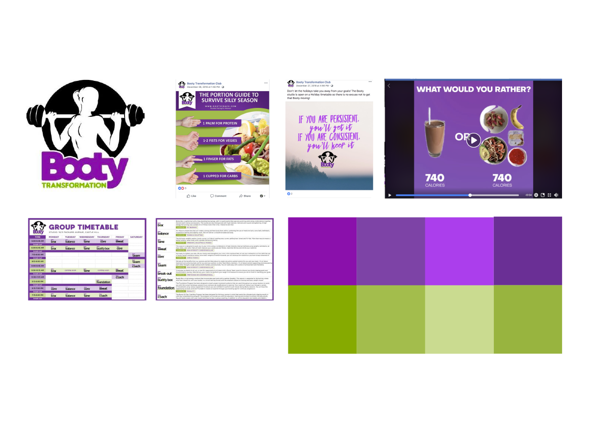
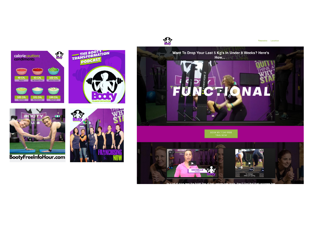
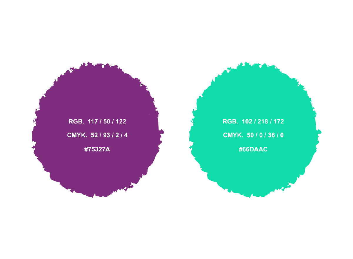
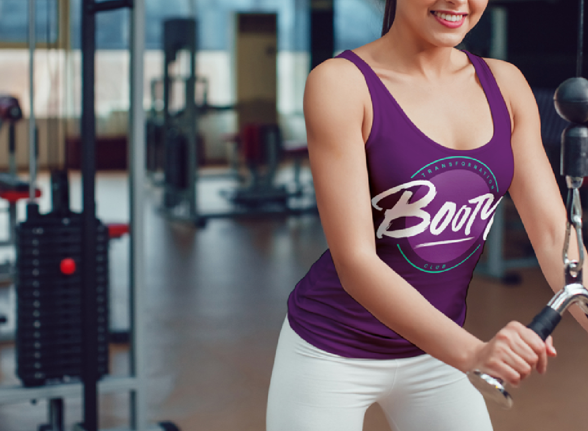
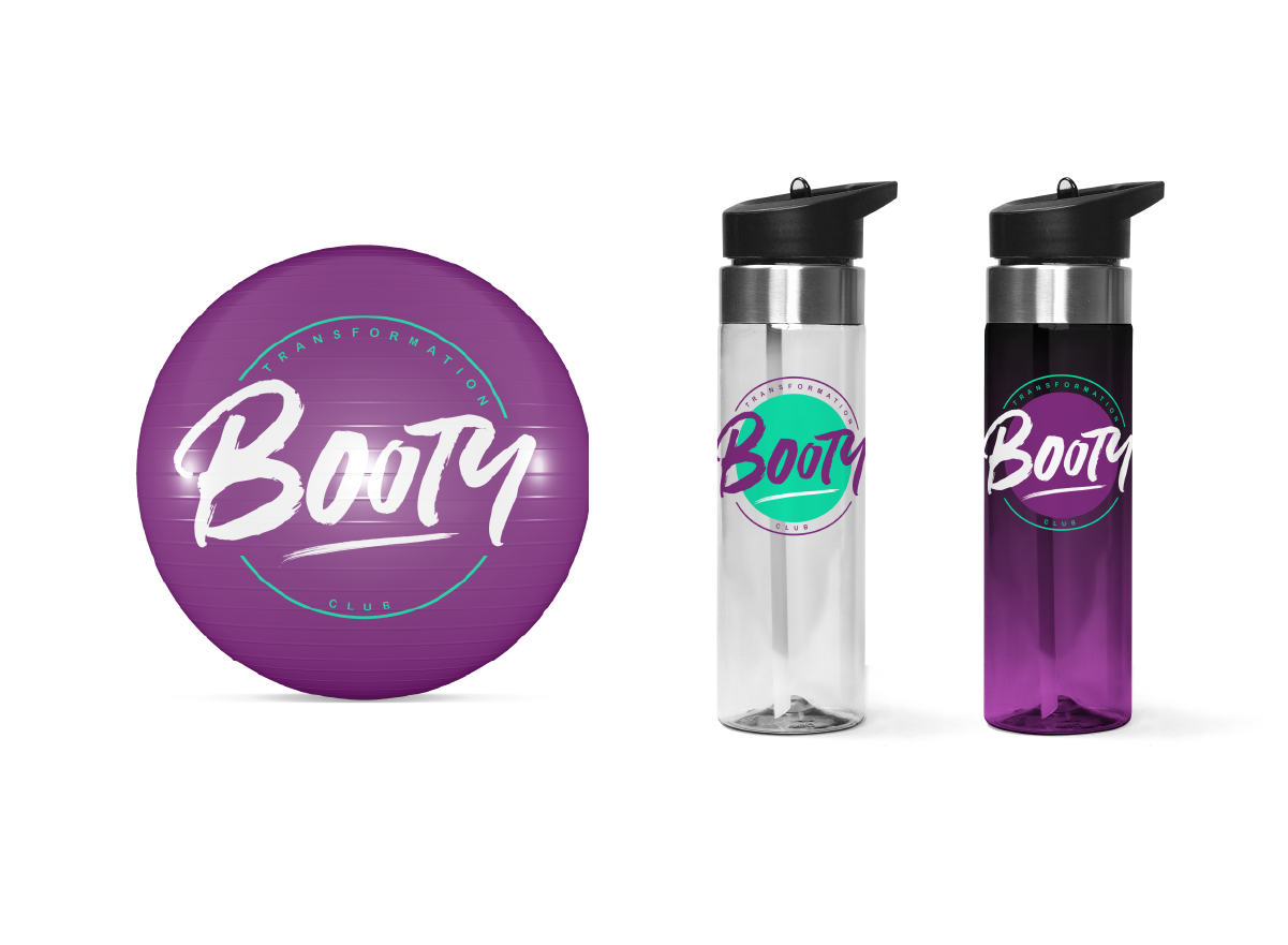
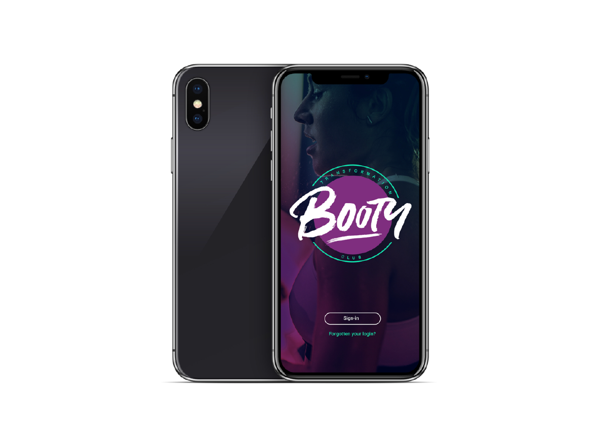
The owners did want to keep a purple as the main colour but were open to me developing a new pallet for them, so to start the process I developed a contemporary spin on their current palette – I created the a similar pallet but using more contemporary colours. Applying this to images as a gradient added strength and drama, and also a degree of femininity to the overall look. The new pallet really worked well in digital applications.
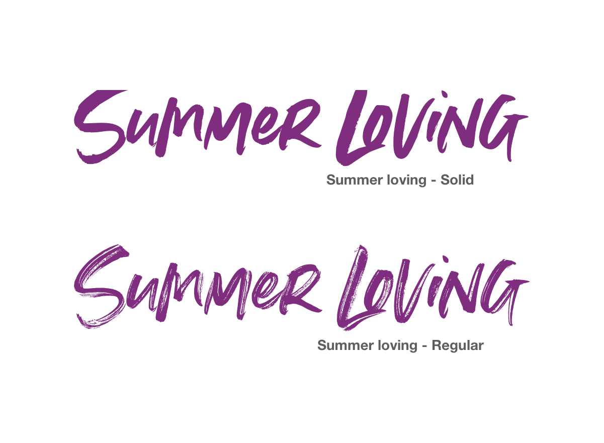
LOGO
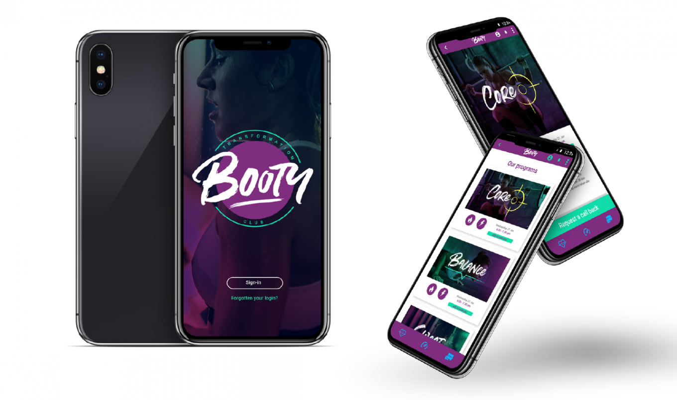
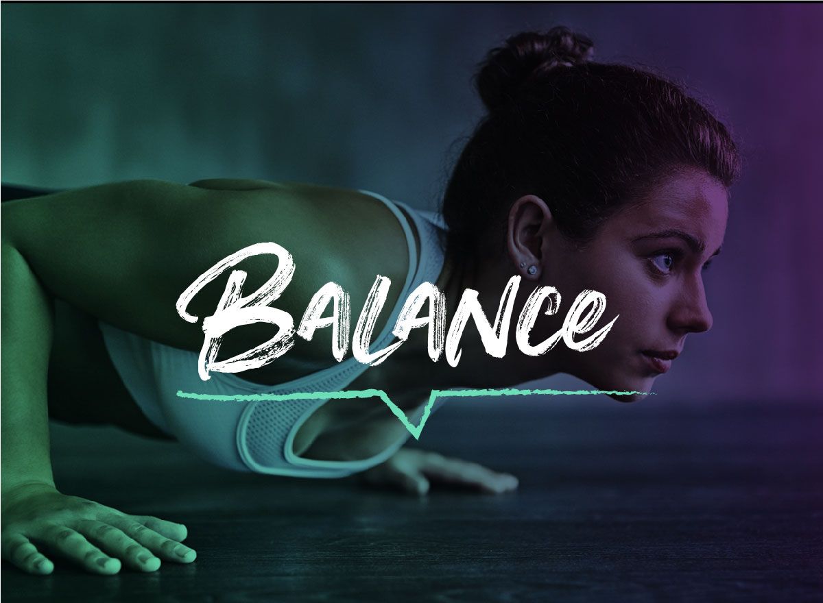
For the logo I wanted to keep a degree of friendliness to the icon, so I moved away from what other fitness providers were doing and I opted for a sketch style font to breakdown any formalities and really make this look like a club and I think we achieved this.
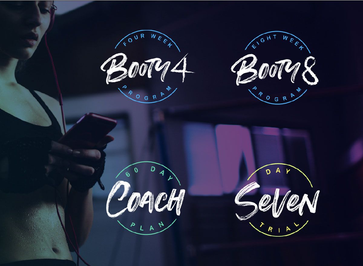
To complete the design system, I wanted to create an identity for the programs that “booty” offered and created embellishments to each program to give it a unique identity.
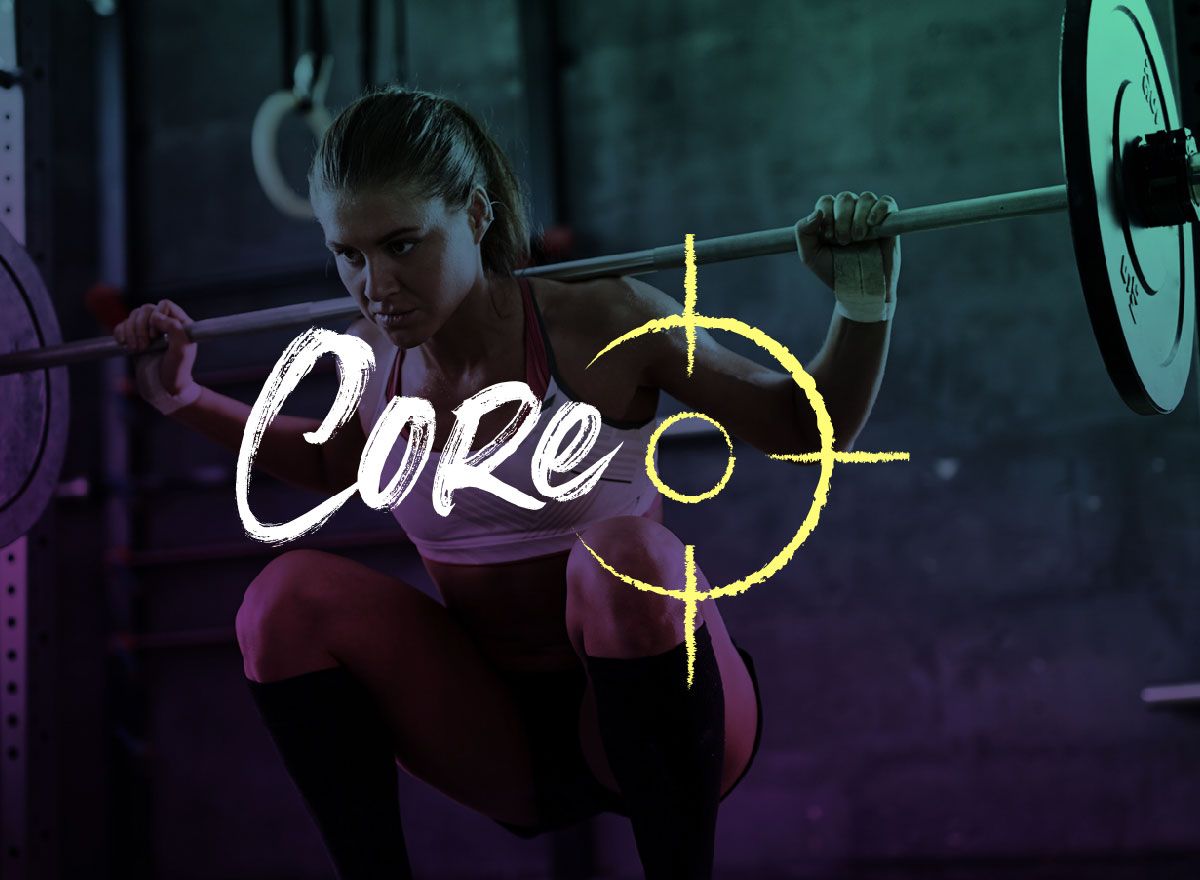
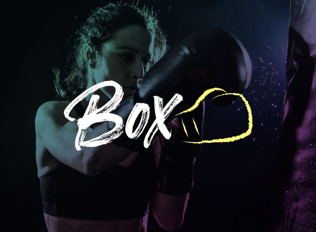
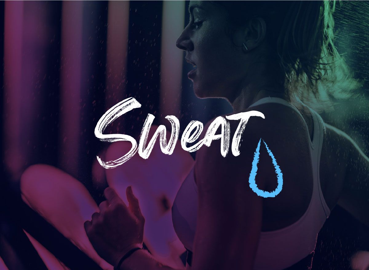
The program descriptions were often a bit convoluted about what the aim of each individual program was for the clients, so I decided to create a set of icons that could be shorthand version of the theme of the work out. For instance to create an icon for “Cardio” or “strength” . Paired up with the program this gives the user a clear understanding of the theme of the workout.
The Result
I want to personally thank Simon for of all the time he has put into our rebrand and acknowledge what an amazing job he has done!
He has most definitely exceeded our expectations.